In 2026, Imperfection Is Your Brand's Superpower
AI made polish free. Now the brands breaking through are the ones that look distinctly human — deliberately imperfect, transparently made, and unmistakably real.
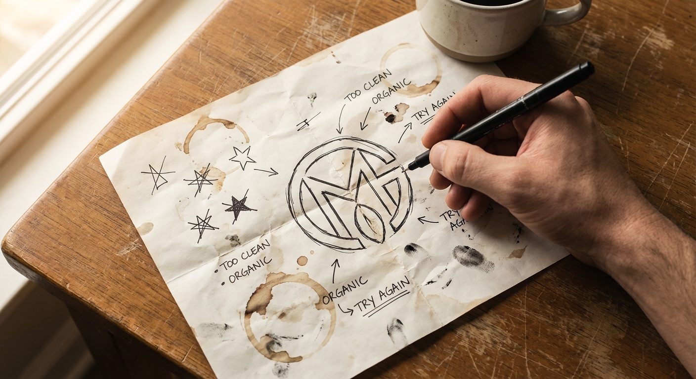
There’s a moment in every design project where someone says: “Can we make it look more polished?”
For most of branding history, that was the right instinct. Professionalism meant precision. A clean logo, perfect kerning, stock photography with the right amount of lens flare. Looking expensive was the goal, because expensive implied credibility.
That instinct is now actively working against a lot of brands. And the reason is surprisingly simple: AI made polish free.
When everything looks perfect, nothing stands out
Generative AI tools can produce a brand identity in minutes. Logo, color palette, social templates, product mockups — all of it technically competent, all of it eerily similar. Browse any startup directory right now and you’ll see the pattern: the same geometric sans-serif, the same gradient, the same “modern” aesthetic repeated hundreds of times.
Consumers don’t articulate this consciously. They don’t look at an Instagram ad and think “that was AI-generated.” But something does register. A sameness. A flatness. The visual equivalent of elevator music — present but not memorable.
The brands breaking through that noise are doing it by looking distinctly human. And often, that means looking deliberately imperfect.
The rise of “human-made” aesthetics
Several design trends have converged around this idea:
Hand-drawn elements. Scribble accents, sketch-style illustrations, handwriting fonts mixed with clean type. Not as the entire identity — but as texture. A reminder that a person made this.
Candid photography. Not the perfectly staged flat-lay or the stock-photo handshake. Real moments, slightly off-center, occasionally blurry. The kind of image that makes you stop scrolling because it feels unscripted.
Visible process. Showing the work behind the work. Sketch iterations alongside the final logo. The messy whiteboard alongside the finished strategy deck. Transparency about how things get made.
Imperfect copy. Writing that has a voice — a rhythm, a point of view, an occasional half-finished thought. Not the kind of airtight, six-times-edited corporate prose that sounds like it was generated by a committee (or an LLM).
This isn’t about being sloppy. It’s about being identifiable. In a sea of AI-generated sameness, the most distinctive thing a brand can do is look like it was made by a specific person with specific opinions.
Pantone is paying attention
Pantone’s 2026 Color of the Year is “Cloud Dancer” — PANTONE 11-4201. It’s a warm off-white. Not a vibrant gradient. Not a neon accent. An off-white. It’s the first time Pantone has chosen white in the 25+ years they’ve been naming a Color of the Year.
On the surface, that seems boring. But it’s a signal. The palette of the moment isn’t loud and maximalist. It’s quiet, natural, grounded. It reflects a broader appetite for simplicity that doesn’t feel sterile — warmth without noise.
For brands, the implication is worth paying attention to. The audience’s taste is shifting away from the hyper-designed, hyper-saturated look that dominated the last few years. Toward something that feels more like a material than a filter.
Privacy as a brand value (not just a policy)
Here’s a statistic that connects branding to something more concrete: according to Cisco’s 2022 Consumer Privacy Survey — a double-blind study of over 2,600 adults across 12 countries — 81% of respondents said the way an organization treats personal data is indicative of how it views and respects its customers. That was the highest percentage since Cisco began tracking the metric in 2019.
That’s not a tech problem. That’s a brand perception problem.
Companies that are transparent about what data they collect, why, and what they do with it are building trust the same way that honest photography and candid copy build trust. It’s all part of the same signal: this brand treats me like a person, not a data point.
For small businesses, this is actually an advantage. You don’t have the compliance baggage of a Fortune 500 company. A clear, honest privacy policy — written in plain English, not legalese — is one of the easiest trust signals to implement. And it’s one most small businesses ignore entirely.
What this means in practice
None of this means you should make your brand look amateurish. There’s a difference between intentional imperfection and actual carelessness, and people can tell.
What it does mean:
Stop optimizing the soul out of your brand. If your logo has a quirk that makes it memorable, don’t sand it down to fit a template. The quirk is the point.
Invest in real photography. A dozen candid photos of your actual team in your actual workspace will outperform any stock photo set. It doesn’t need professional lighting. It needs to be real.
Write like a person. Not every piece of copy needs to be a masterwork. But it should sound like someone who gives a damn wrote it. If your “About” page could belong to any company in your industry, it belongs to none of them.
Show your work. Behind-the-scenes content isn’t filler. It’s proof that real people with real expertise are behind your product. In an AI-saturated market, that proof is becoming the most valuable brand asset you have.
Be clear about data. Tell people what you track and why. Make your privacy page readable. Don’t bury opt-outs in a 40-page terms document.
The brands that will earn trust in 2026 aren’t the ones that look the most expensive. They’re the ones that look the most honest.
And honest, it turns out, looks a little imperfect.
Sources
- Pantone — 2026 Color of the Year: Cloud Dancer
- Pantone — Press Release: Cloud Dancer Announcement
- Cisco — 2022 Consumer Privacy Survey (PDF)
- The Branding Journal — Top Branding & Design Trends for 2026
- Adobe — The Four Creative Trends That Will Define Marketing in 2026
- Lippincott — 12 Trends Set to Define 2026